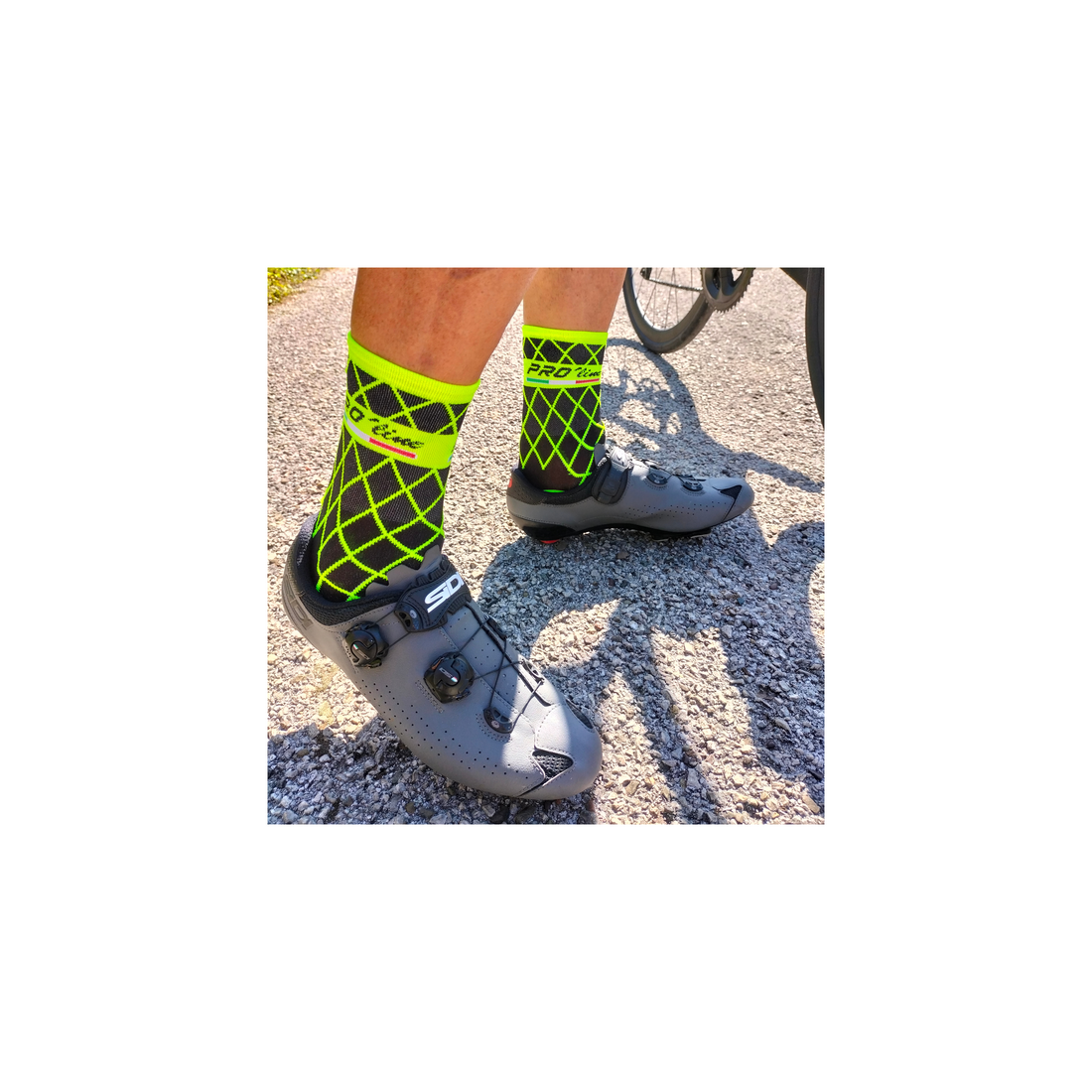
Cycling socks are a little different from regular socks. Cycling is a matter of aerodynamics, so a cycling sock must be comfortable and suitable for pedaling .
Above all, it must not interfere with the set-up of equipment or clothing. Everything about a cycling sock is important: it must look good, but it must also be functional!
But what exactly defines a cycling sock as better than others ?
At PRO 'line we have a checklist of key points that we follow to the letter every time we create a model.
Everything can be summarized in 5 factors:
Lightness is a distinctive feature of every PRO 'line sock . Weight is an advantage for both the cyclist and the sock, because a lighter sock is also more comfortable. And of course, the lighter the weight, the better the feel on the foot!
Comfort is one of the main characteristics that anyone looks for in anything they buy. Whether it's cycling socks or socks in general, comfort is a must. Comfort for us means feeling comfortable without irritation due to the product you are using.
Cycling socks must be made with quality materials, to ensure proper breathability. This means they must be able to wipe out sweat and moisture , keeping feet dry and cool to ensure optimal performance .
Perhaps the most important point to consider when creating a cycling sock is the design . Socks can make or break cycling clothing. You certainly wouldn't wear a suit with a yellow and black striped top with a pair of red and white striped pants and shoes. You would look terrible!
The same logic applies to socks, one of the things we think about while designing and processing our collections is that the socks represent that plus, that distinctive element that makes the whole outfit more beautiful , pleasant , unique .
The main colors of the PRO 'line cycling socks are fluorescent yellow , fluorescent green and fluorescent orange that we combine very often with the bases represented by white and black . With fluorescent yellow and black you can create a wide variety of combinations. The fluo colors are a symbol of the PRO 'line style and this is evident in many of our collections.
By following these points we develop and implement our experience to put it at the service of our #fluothinkers , each new design represents an impetus , a projection towards improvement but also an opportunity for growth and comparison with those who support us and renew their trust by allowing us to continue to have new creative visions .

